
As a graphic designer, you will likely be challenged at some point in your career with creating some type of large format design. While “large format” doesn’t have a formal size definition, it’s a design that’s usually viewed from a distance and is, well, large. We’re talking billboards, trade show displays, vehicle wraps, or even custom flooring and walls. Given the massive size of these designs, the stakes are higher; the larger the design, the bigger any mistakes will appear. On top of that, large format printing is expensive. You’ll cringe at having to reprint your work because of an avoidable mishap.
So, before you hop into your design software to get working, take a look at these five tips for designing in large format.

Consider the Environment
Before ever putting your mouse to an artboard, you should thoughtfully consider where your design will be seen and how it will be experienced. Ask yourself:
- Who’s going to see it?
- Can you assume they’re already familiar with the brand or subject matter?
- At what distance will they see it from? And from which direction?
- What is the surrounding environment like?
- What environment will people view it from – their cars, while walking down the sidewalk, in a conference room?
Answering all of these questions will help you decide what kind of design is appropriate for the environment and how people will experience or interact with it.
Less is More
In a large graphic, it can easily get overwhelming for the viewer if there’s too much going on. Four seconds is the average amount of time spent looking at something upon first glance, so you’re message needs to be clear and understandable within that short amount of time. Take billboards for example. Driving past, there’s a short opening of time when the driver will be able to focus on it out their dashboard window while attempting to navigate traffic. Design for that driver. The design should be incredibly simple, with no more than an image and a short sentence or phrase. Now, this is anything but easy. You may have heard the quote, “If I had more time, I would have written a shorter letter.” It’s incredibly difficult to get your message across in a short amount of copy, which is why your imagery and copy need to be working closely together to create a quick, compelling advertisement.

Use High-Quality Imagery
If you’ve been a designer for any time at all, this almost goes without saying. We’ve all had the experience of placing a decent-looking photograph in a design, only to print a pixelated mess. With large format designs, you can’t go pulling a logo off a company’s website or use a picture shot on someone’s smartphone. Start with high-resolution imagery (the resolution needed will depend on the size of the project). This also means scaling your images in Photoshop (not InDesign) and tailoring your output resolution to your project.
On that note, because these works can be so large, it’s a good idea to work at a ¼ scale. This makes it much easier to store your graphics and share them with others for proofing. Just make sure you do your math right, check your calculations, and proof your design in its final size before printing.
Always Use Vector Graphics
Unlike raster, vector graphics are not made up of pixels on a grid. They’re comprised of paths using mathematical formulas, allowing for more flexibility. Nerdy stuffy aside, vector graphics allow you to scale up or down in size without losing resolution quality. The most common vector file types are .ai and .eps. Use vectors to create everything from logos and icons to block colors. They’ll help you achieve that high-quality imagery we talked about above.
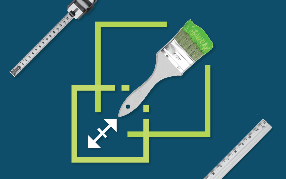
Accuracy is Key
As I mentioned at the beginning of this blog, accuracy is the most important aspect of large format design. What may have looked like a tiny mistake in your file can easily become one-foot-tall when it’s printed at final size. A focus on accuracy and doing things right is crucial from start to finish. Avoid Smart Guides, look for more reliable alignment tools and stick to your coordinate system. Double-check to make sure your color-matching is correct. Grab a copyeditor to review your work. And then grab five more random people to look at it before printing. When you’ve looked at something so closely for so long, it can be hard to see the mistakes that are staring you in the face. Having outsiders (who’ve never seen the design before) look at your work makes a huge difference in building confidence in your end product.
Need some help on your next large format design project? Give a shout here at PRIME to see how we can help.
If you enjoyed this edition of PRIME Pulse, take a look at some of our other related articles:
- 4 Steps Toward a Better Content Marketing Strategy
- 5 Reasons Your Website is Never Really Done
- 10 Ways to Communicate Empathy and Authority Amidst Crisis
- 4 Reasons Your Messaging is Falling Flat
- The How-To on Facebook Marketing Campaigns