
There's an old saying in marketing called The Rule of 7. Discovered by former advertising executives of the 1930s, the Rule of 7 is the average number of times a person must be exposed to your messaging before taking any action. Luckily with a solid social media strategy planned out, this becomes much easier. But it only works if your potential buyer recognizes your brand every single time they see it. For this to happen, your brand needs to be consistent across various topics, no matter the location or situation.
The Risk of Ignoring The Need for Consistent Branding
It's hard enough to get in front of your people. Instagram's algorithms only get more narrow, while the number of companies for buyers to choose from only widens. This means your window of opportunity for resonating with them becomes not just small, but imperative. From the moment their eyes land on your post, video, or webpage, they've got to know it's you, what you stand for, and whether they resonate with it.
Your brand needs to act the same wherever, whenever; otherwise, you risk losing them on a critical touchpoint. You can't have your old logo on Twitter, your new look on your website, and something in between on your business card. It seems like a non-essential issue, especially when you know they just need your email or phone to get a hold of you, but if you don't bring consistency to your brand, people will lose confidence in your services as a whole.
It may sound off to you, especially if you have been doing business for a while, but with the influx of design services over the last decade, how you look conveys just as much viability to prospective clients and what you actually do. So, naturally, the next question is how to get things in line? By having a well-defined brand that is canonized in an official set of brand guidelines. Without them, you're leaving your brand up to all kinds of interpretation.
What All Goes into Brand Guidelines?
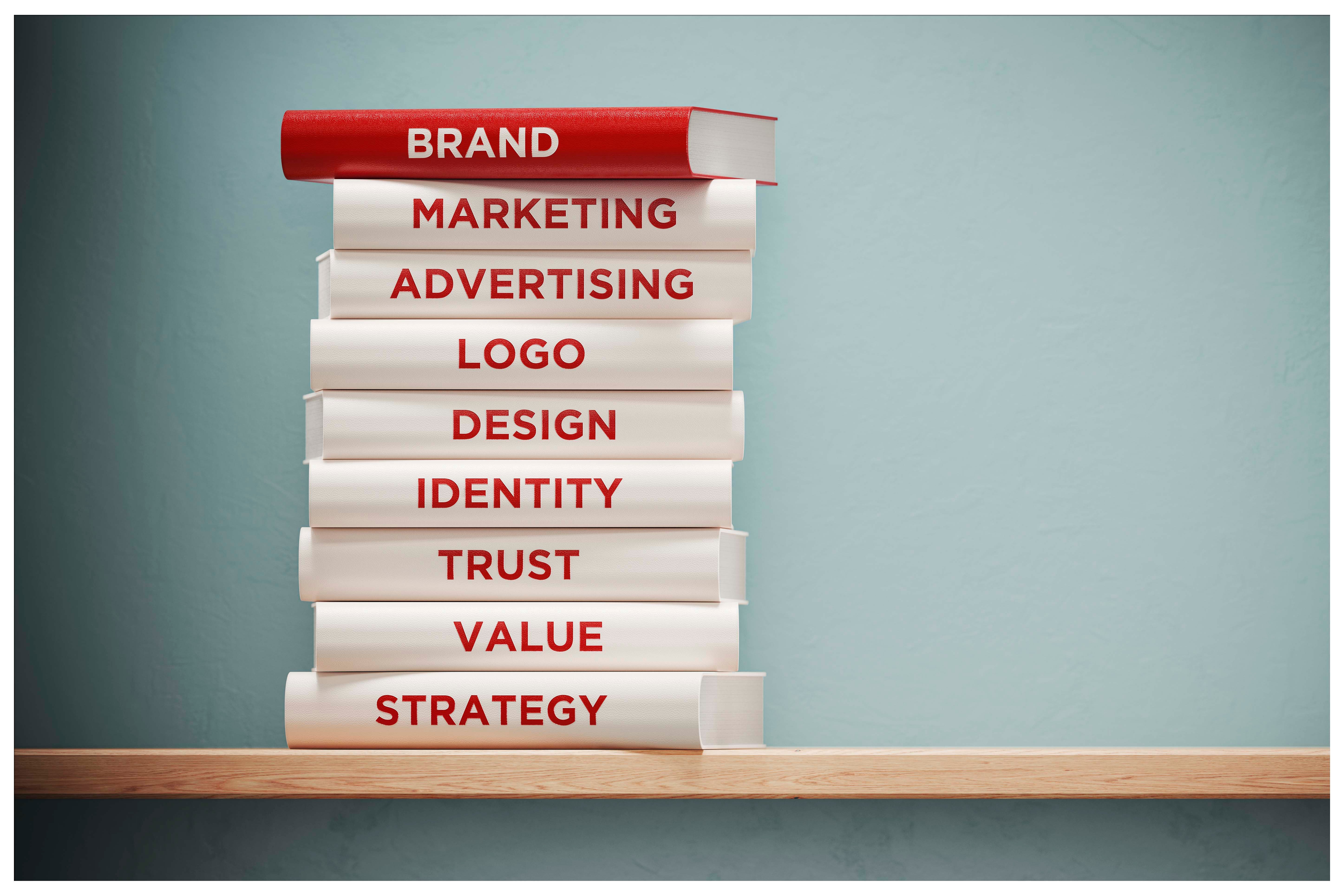
While many things can be included in your brand guidelines, there are a few must-haves that should always be present. Some of these you may already have figured out, while others may take a little more digging. In a general sense, colors, fonts, and spacing are the basics of design in your brand, but you also have messaging guidelines on how to treat your mission and vision, the voice of your brand, and affiliations.
Why You Need Brand Guidelines
Brand guidelines are just like they sound—a set of clearly stated characteristics that define your brand on multiple levels. Brand guidelines ensure that the H.R. person doesn't change the color of your logo on the latest company job posting. They function so that the ambitious, green copywriter you hired doesn't use the wrong tone of voice on your website. The oversight of guidelines helps your social media manager doesn't respond to customer feedback in a way that conflicts with company values. When you partner with other organizations, it makes sure that your logo, attach to their promotion, doesn't get squished or stretched, is the right color, and has the right amount of padding around it to keep it legible.
These guidelines are the Ten Commandments of your company. Having your brand outlined in an official company document makes it easy to share and gives the rules a sense of authority. Your not just disagreeing with your young copywriter's approach of an opinion they assume is outdated; you're following the brand guidelines. The guidelines give the brand standards an official authority that is impossible to argue with, ensuring consistency through company policy.

Your Mission Statement and Company Values
This is one that if you haven't figured out yet, you should as soon as possible. Knowing the answer to this question goes deeper than just your brand guidelines. This should be the backbone of every move your company makes, and without it, you're operating without a clear purpose. Start With Why, Simon Sinek's widely popular work finds a significant portion of its audience amidst these efforts.
Figuring this out may look like a meeting with your core executives, or just you alone for a dig-deep session at a coffee shop. However it gets done, it's crucial to set time aside to put into words why you do what you do, and the values that are at the root of that why. Here are a few examples of defined "whys" and their accompanying values to get you started. If this still isn't clear cut enough, we highly recommend watching Simon Sinek's Start With Why TEDTalk as a primer for what lies ahead in this task. (Heck, even if you already have defined why's, we recommend clicking the link — seriously, there's a reason it has nearly 7 million views).
Here's a snapshot of a couple why's:
Why: To increase a sense of connectedness and spread positivity on digital platforms.
Values: Community, honesty, kindness
Why: To serve those in need through education
Values: Compassion, perseverance, service
Why: To help those suffering from chronic pain regain their autonomy
Values: Health, knowledge, equality, determination

Your Brand Color Scheme
This one is more concrete and may already exist loosely on your website or within your logo. But declaring this officially, you put a halt to Karen in H.R. messing up the logo. You give your partners clarity, rather than leaving the guessing work to them. You allow your voice to hit your value, rather than being mutated for an ad-hoc post. Color communicates a lot. Have it say what you want, with consistency, rather than scream confusion along the way.
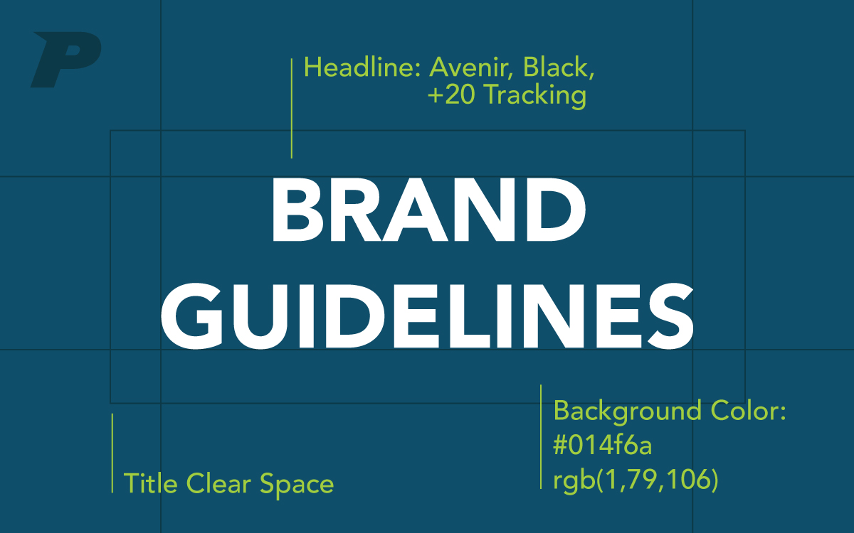
When defining your brand colors, you'll want to specify which colors are your primary brand colors (most prominent) and your secondary colors (accents or highlights). If you get into tertiary color palettes, you probably have a series of design and marketing employees, so we'll let you charge ahead on your own. If you're not that big, stick to primary and secondary.
That being said, don't go overboard — you don't need more than five colors (and that's a lot) to make this happen. Once you've defined your colors, be sure to accompany them with their CMYK and RGB values for ultimate clarity. This ensures that strange hues of your colors don't end up everywhere. It is especially helpful for print projects, and specific digital displays, especially in high-def/4k+ environments.
Your Brand Typeset
Typeface refers to the fonts you will use whenever designing anything for your brand. Included in this is the font you'll use for your headings, subheadings, and body copy. You'll want to specify the font's name, the weight of each font, any special kerning (amount of spacing between your letters), and even size.
Your Logo Specifications
This one is non-negotiable. It's one thing when your colors get changed a bit here and there, but when someone messes with your logo, it's a declaration of war. Ok, maybe that's a bit of hyperbole, but it definitely has to be hedged off at all costs. Having your logo specs in your brand guidelines is the best way to do this. Be sure to include your primary logo, secondary variations, and any tertiary particulars that pertain to social media.
Your Tone of Voice
Including your tone of voice is a great way to protect the less visual side of your brand, but it's still incredibly important. Your tone of voice is how you feel to your audience, how you sound, even the feeling they get when they think of you. Including your tone of voice means you never sound more stuffy, playful, flippant, or refined than you really are. Whether it's the woman in HR or the new copywriter speaking for you, it should always sound the same.
Do you have brand guidelines? What's been the most imperative part of having them as part of your company? We work at realigning brand guidelines and rebranding a variety of companies, so let us know if PRIME can help you put your best foot forward, consistently in today's design-driven culture.