

I know what you’re thinking. Designing for a financial institution sounds like a real drag. But it doesn’t have to be. I like to think of it as a fun challenge – using design to make community banking feel easy, personable and attractive. Believe it or not, some of my favorite work has been for a local credit union.
Here are several things I’ve learned along the way that make designing for credit unions a heck of a lot easier (and more fun).
Design for Your Audience
Different financial products are targeted at different audiences, and any designs should reflect those differences. Use color, style and other design elements to gear your designs to the intended demographic. Showcasing first-time credit cards to 20-year-olds? Use color! Illustrations! Typography! Highlight things they’d want to buy with the cashback they earn. Focusing on opportunities to refinance on a home? Tailor your designs to a slightly more mature demographic, utilizing images of family life, home improvement and the experiences that come with that stage in life.
Make Room for Compliance
Ah, compliance – you can’t ignore it in the financial world, so you learn to make space for it in your designs early on. It’s always important to ask if you should include nondisclosure language, equal opportunity housing logos, or anything else that’s necessary to stay compliant. Trying to squeeze a logo into your design at the end is never fun, throwing off the balance of your entire design. ADA (Americans with Disabilities Act) compliance is also something to pay attention to, particularly when it comes to text contrast. Make sure the contrast between the text and background is greater than or equal to 4.5:1 for small text and 3:1 for large text. Your credit union or client may have other compliance requirements, so ask early to avoid any last-minute mishaps.
Make it Fun
Graphic design for credit unions doesn’t have to be all stale men in suits and serious taglines. Members and potential members appreciate a good balance between catchy taglines and visuals they wouldn’t normally see from a financial institution. In my experience, a little personality goes a long way.
Small bits of animation can also be super helpful in drawing the eye to an email heading or social media ad. You always get better results with movement rather than something static. Don’t be afraid to dip into After Effects or Photoshop and create some simple movement that will create a bigger impression on viewers.

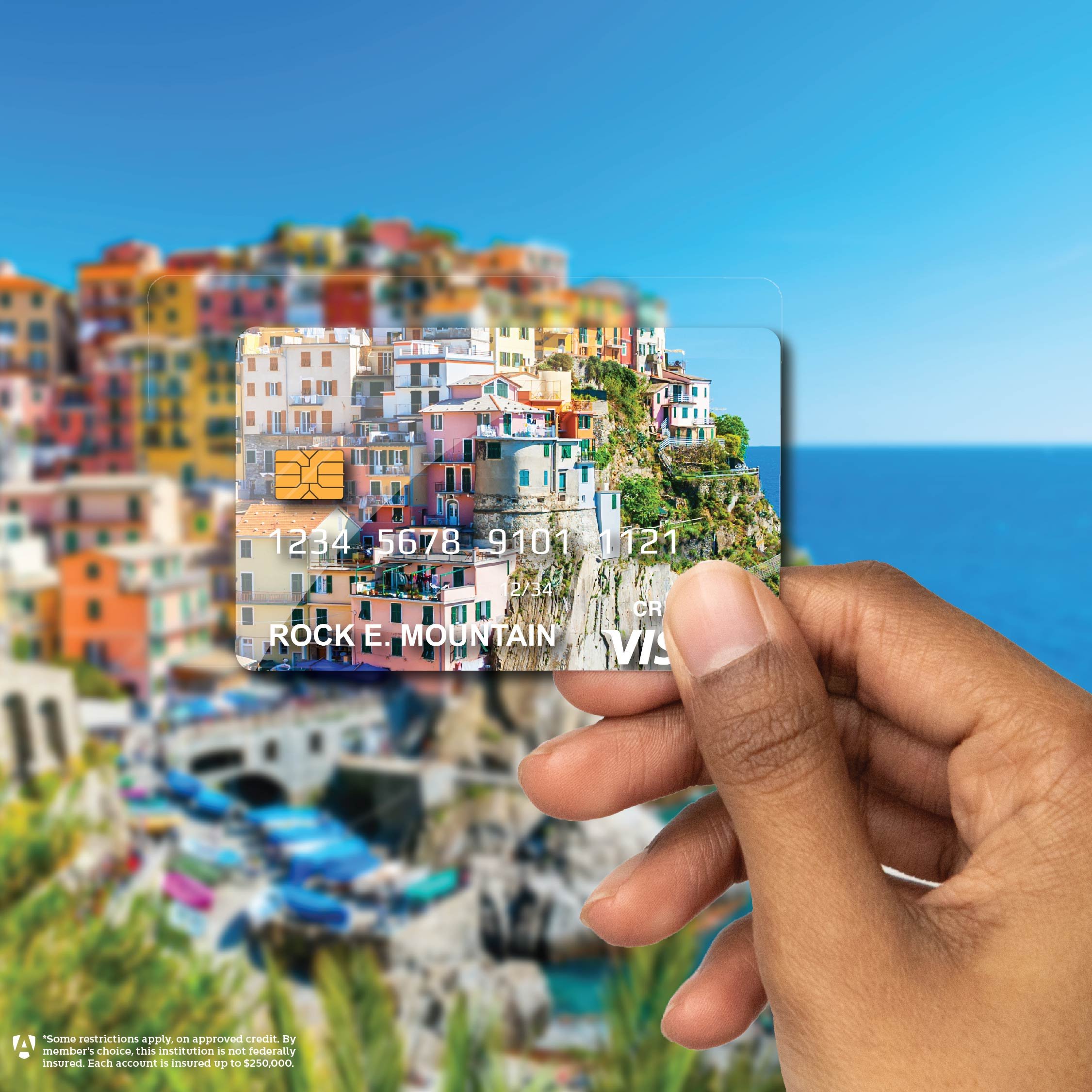
Photoshop is Your Friend
Remember those magazine collages you use to paste together in your elementary school art class? It’s time to channel that same technique in Photoshop and Illustrator. Graphics for credit unions often involve a variety of elements: photos of people, products like credit or debit cards, and assets people are looking to buy, like cars or homes. To get the design I’m looking for, I’ll use a good deal of photo manipulation combined with some of my own illustrations.
There are also a few things that come in handy with Photoshop, like changing names and numbers on credit cards or removing recognizable brand marks (like the names on car bumpers) to avoid copyright issues.
Design for Community Connection
Credit unions are all about bringing members together based on a commonality, like the place they live, the job they have or their alma mater. They’re member-focused, and that’s what I strive to highlight. For example, I’ll use imagery of the locations members live in, as well as imagery of tellers, lenders and other staff engaging with their communities whenever possible. Humanization is important, and design can help.
Bonus pro tips: This is true for any digital ad, but make sure you “save for web” anything that will live online. Don't "export as" or "save for screens.” Make sure the size of your ads are exactly as required, and save all ads for RBG instead of CMYK to ensure all of the colors translate over the web.
Use these tips to embrace the challenge of designing for credit unions and create a style that will be memorable to your members. Remember, it’s all about creating graphics that spark joy and create connection with your brand.
Looking for a designer who’s experienced in working with financial institutions? Reach out to us here at PRIME. We’ll help you upgrade your look and feel, and a whole lot more.
If you enjoyed this edition of PRIME Pulse, take a look at some of our other related articles:
- A Financial Institution's Guide to Compliance in Digital Marketing
- Connecting With Your Audience Through Graphic Design
- 7 Strategies to Target New Demographics for Your Credit Union