
Quite often, the objects we encounter every day are laden with history and reason, and we are unaware of it. It's understandable. For starters, we're busy guys and girls. Not to mention, we can't possibly be walking, talking experts on the reason, historical context, and functionality behind everything we touch in our world. To quote an icon, "...ain't nobody got time for that."
Take us here at PRIME, for example. We're not experts on how the pencil came to be (though we have a few Golden Pencil Awards among us). We couldn't tell you who invented Mother's Day (though we thank you, and now you and I will Google who did). We've got no real grasp on the history of earbuds (but we lean to the Bose side of Beats by Dre vs. Bose). We do, however, know a heck of a lot about design – Minimalist design, to be exact.

What is Minimalist Design?
To fully understand minimalist design, you've got to know how it came to be and where it came from. The real roots of minimalism, in its theoretical sense, can be traced to Japan, particularly the principles of Zen and the simplicity supporting it. In opposition to the Gothic and Victorian influences of the West, post World War I visionaries like Architects Ludwig Mies van der Rohe, and Buckminster Fuller practiced a Dutch abstraction known as De Stijl. The design movement began in Switzerland in the 1920s and was applied to several disciplines: graphic design, architecture, music, literature, painting, and more.
In today's understanding of Minimalist Design, we look to pioneers like Dieter Rams as someone who transferred these ideas to consumer products and furniture. He was the (self-titled) Creative Engineer for the Braun company for many years. If he seems a bit obscure, just know that companies like Apple and IKEA consider his design principles to be the apogee insight into how they develop the look and feel of their products.
So, while we give accolades to someone like Steve Jobs (or more appropriately Jony Ive) for making people love the amount of white space on a website or the simplicity in digital application design, the principles of Zen were focused on this way before the iMac came about. When it comes to visuals, there is a Zen concept called "Ma," translated roughly, negative space, or the space between objects — starting to sound like minimalism?
The De Stijl art movement, also influenced by American architect Frank Lloyd Wright, developed a methodology called Visual Thinking. His disciplines were also influenced by what he termed organic principles of design, often seen in Japanese gardens, architecture, and spatial design. It would be a bit of back and forth from this point, where Dutch architect Hendrik P. Berlage took Wright's design as inspiration for implementations into De Stijl's architecture movement.
After World War II, American art had spun its Abstract Expressionism wheels into the ground (think the frantic, staccato-like work of Jackson Pollock). Newer artists began moving in the opposite direction—cutting out the frivolous and focusing on the act of stripping artwork down to the essentials. It's here that the key factors were determined and defined, and here that we found the beginning of modern minimalist design that is all around us today.

Key Factors or Minimalist Design
Functionality
Two common concepts of minimalist design involve innovation and usability. If you have ever heard the phrase, "form follows function." In other words, a leading aspect of any object or art is its function. The ease of use must be at the center of the reason that the piece exists, closely followed by functional purpose. An object or piece of artwork that stirs visual thinking and intuitive functionality will deliver a pleasing experience.
Negative Space
Minimalist design is all about wiping away all excess until you are left with the absolutes. The phrase, "Subtract until it breaks," applies here. There are no flourishes or filigree to be found here. A designer knows minimalism has been reached when there is nothing left to pull from the design without losing essential information.
This means that white space, or the negative space surrounding your design elements, is imperative. Let's take Apple and web design as an example. Every site has a margin, where content cannot be displayed. In an environment that was full of gradients and background images, implementing a background of white connects the space between images and characters as accents to the area that exists in the framework. You no longer see spacing on the page as breaks between objects, but a connected white space to the larger white space that exists on all sides of the content.
Less is More
Just as you don't want to clutter your space with too many elements, you want those elements to feel uncluttered, as well. Opt for simplified factors. Modern design typically steers away from loud colors or complicated fonts — the design gets out of the way. Instead, choose muted tones that lean towards a more neutral and natural palette. For your typeface, keep it straightforward and readable. We love good hand-lettering design as much as the next chap, but now is not the time or place.
As for your design, stick to the rulebook and follow the rule of the Golden Ratio. This keeps things simple for your viewer and immediately directs their eye where to land for easy and uncomplicated viewing. All these factors come together to create a sense of calm when viewing the design. A sense of Zen, one might say.
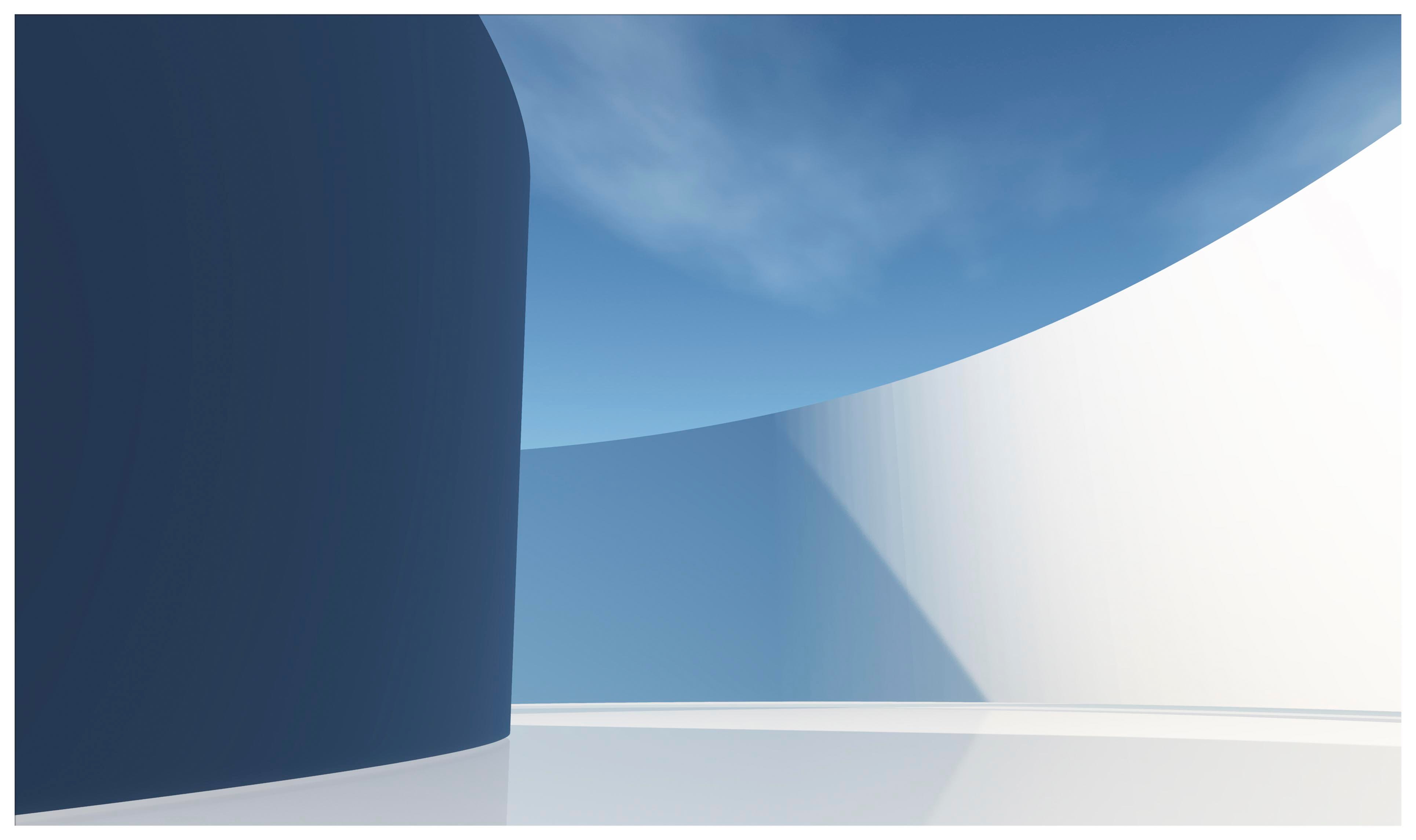
Minimalist Design in Your (Negative) Space
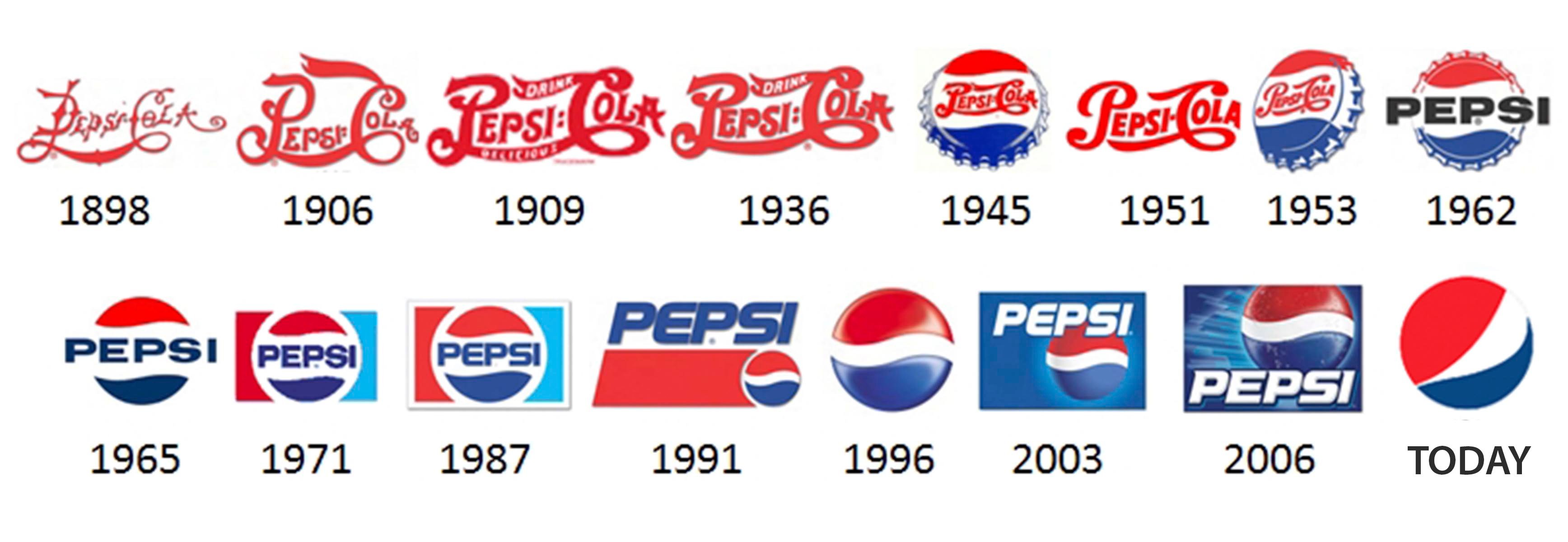
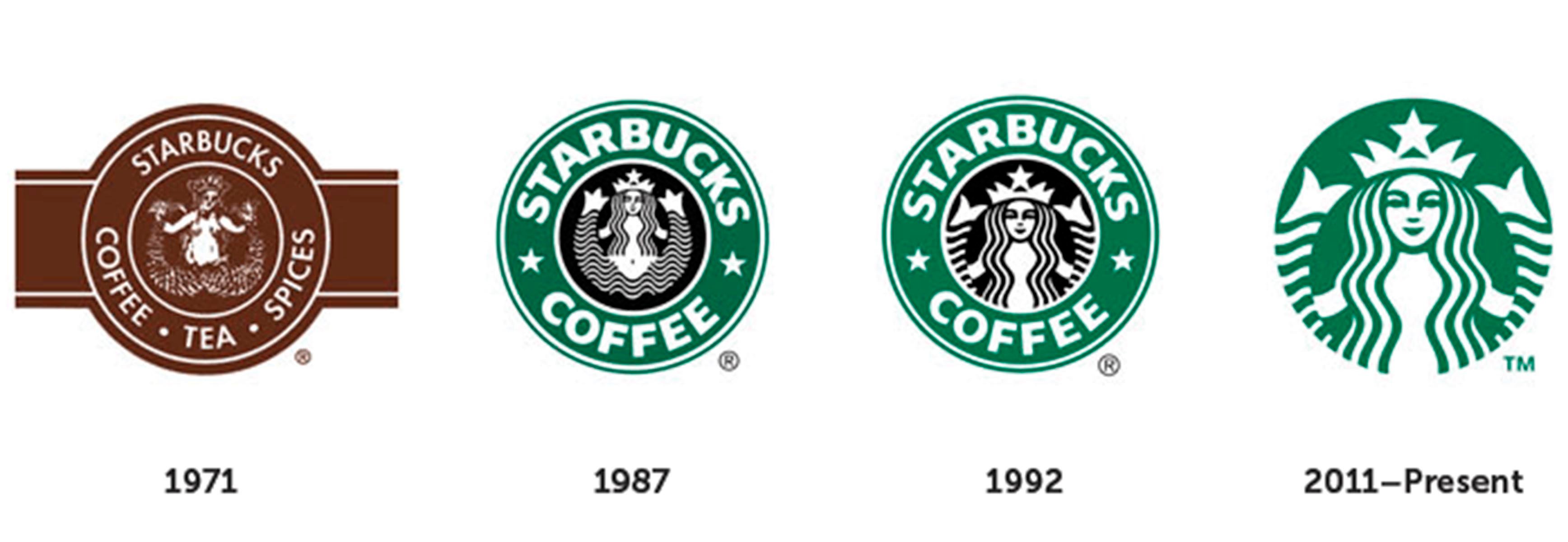
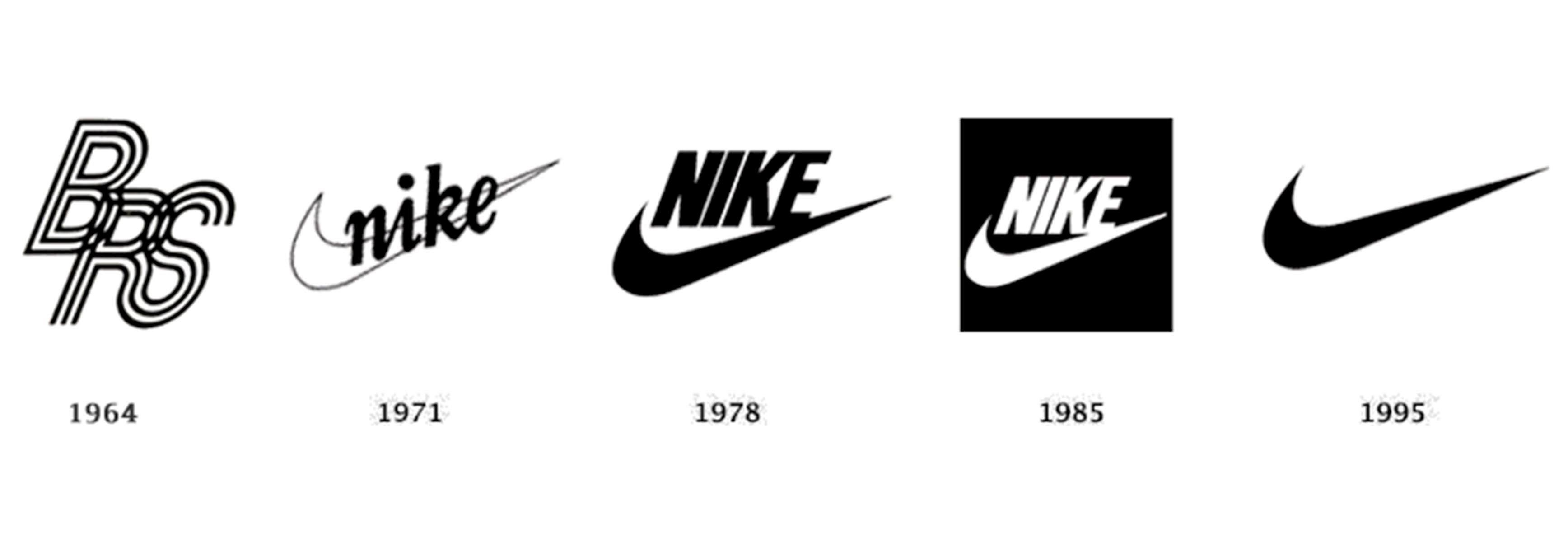
Minimalist design is all around us, and we come in contact with it more often than we realize. Almost all your favorite brands have slowly been transitioning their look and feel to fit a more modern, minimalist approach. Some are so subtle you likely don't even notice. Take a look at the following examples of some of the brands you might recognize. Notice how their logos have progressed to a flatter, simplified, less chaotic iteration of their earlier versions.
PEPSI
STARBUCKS
chili's

NIKE
TACO BELL

Notice anything interesting? If you look at the most recent logo for each, they've moved away from a more detailed illustration to something that should look very familiar—an icon on your smartphone.
Minimalist Design Meets Flat Design
There's no better place to watch the world of design trends unfold than your smartphone updates. Today, all phones, as well as a lot of websites, are designed with flat design. There can be a degree of vacillating between gradients and drop shadows at certain times, pops of color, and contemporary patterns, but flat design has been ruling application design for several years.
Flat design occurs when excess detail or accents are stripped away. This trend started as a way to simplify data load and file size from websites that were slowing down performance. Things like drop shadows, shading, and major animation are all data points that need to be processed whenever a webpage loads. If you want to increase functionality (smack of minimalism?) and speed up your webpage, you remove those excess features.
It turns that that flat design not only improves performance, but the people approve! Users were immediately attracted to the simple and clean lines that came with flat design. Human beings seemed to appreciate the simplicity and legibility of flat design. Rather than be overstimulated by visuals, aesthetic simplicity took the forefront.
But, as with any system, problems arise, and innovation takes over. While users leaned more into flat design, they also had a hard time recognizing important information. Additional detail helps designers indicate what's important. If the function of my webpage is to get you to click a button, I want to make that button stand out. With flat design, it's hard to differentiate those critical action items, and just as hard for users to recognize them.

The Introduction of Flat Design 2.0
Like we mentioned earlier, most movements are a response to the one that came before it. Flat design 2.0 is precisely that. It takes the simplicity of flat design and adds small detail elements back in to aid the user. A great example of this would be the gradient on our Instagram app.
The app itself no longer looks 3D on your phone—both Apple and Samsung have done away with that. However, the app does include a 2D gradient that gives the icon some detail and attracts your eye. Designers have begun implementing small changes like this that grab the viewer's attention without sacrificing functionality or processing time. Little features like gradients, drop shadows, hover colors, and tiny slide graphics all help call the user's attention to the appropriate places without cluttering design or sacrificing the positive attributes of their overall minimalist design.
How do you feel about minimalism? Do you think it's the future of design, less a fad than a new platform? Or do you think it will have a bounce-back effect, as most artistic movements have throughout history? Tell us your opinion in the comments below!